A Different Look for the Home Page
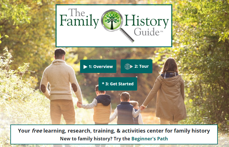
When you access the Home Page for The Family History Guide, you’ll notice a new look. There’s one cover photo now, with a centered layout for the text and buttons. On phones, the single photo makes for less scrolling. The photo may be changed occasionally for variety.
The three buttons are numbered in suggested order of use: 1 for the Overview video, 2 for the Tour, and 3 for the Get Started page. This helps those who are new to the site quickly identify the main tasks to start with on the page. The top menu works as before and is basically unchanged.

One additional change: the Media Resources link has been moved from the Intro menu to the Media menu.


