Home Page Updates
We don’t often change the content of the Home page for The Family History Guide, except for what’s in the picture carousel, and the Featured Blog posts at the bottom of the page. Recently we received some good feedback from our user community about making the Home page a little easier for first-time users, so we decided to incorporate some of those changes.
Here’s a summary of what’s new …
- Down-arrows have been added below the top menu items. This makes it more obvious that there are menu actions available there when you hover in that area.

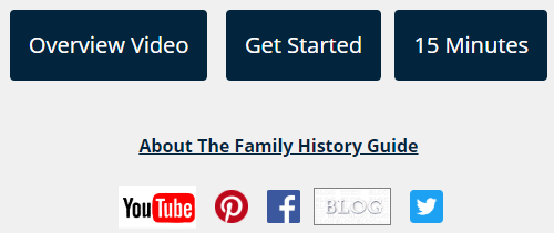
- The Overview video for The Family History Guide is now in the first black button on the left. Previously, the Quick Tour video was there, but the Overview video is shorter and more direct as an introduction. The Quick Tour is now in the Watch and Learn section where the Overview used to be. Spoiler alert: The Quick Tour video will be updated with new features in the next few weeks.
- The links for “About” Blog” and “Association” have been consolidated into “About The Family History Guide”.
- Social media icons have been added in the left area, to make them easy to find. Social media links are also available in the Blog/Social menu and in the footer of each page. Another spoiler alert: We will be launching our Instagram page this summer, so stay tuned!

- An arrow and tips have been added to the Features carousel.
- A link to the Mission Statement link has been added in the middle of the page.
We hope you enjoy the (slightly) new look of the Home page. For additional changes that are coming to The Family History Guide, see the Previews of Coming Attractions blog post.


