New Look for the Home Page and Menus
We are excited to announce a new, streamlined look to our Home page at The Family History Guide. This also includes a tiered menu system that gives easier access to a number of features across the site. Here’s a step-by-step walk-through that demonstrates the new additions.
Home Page Design
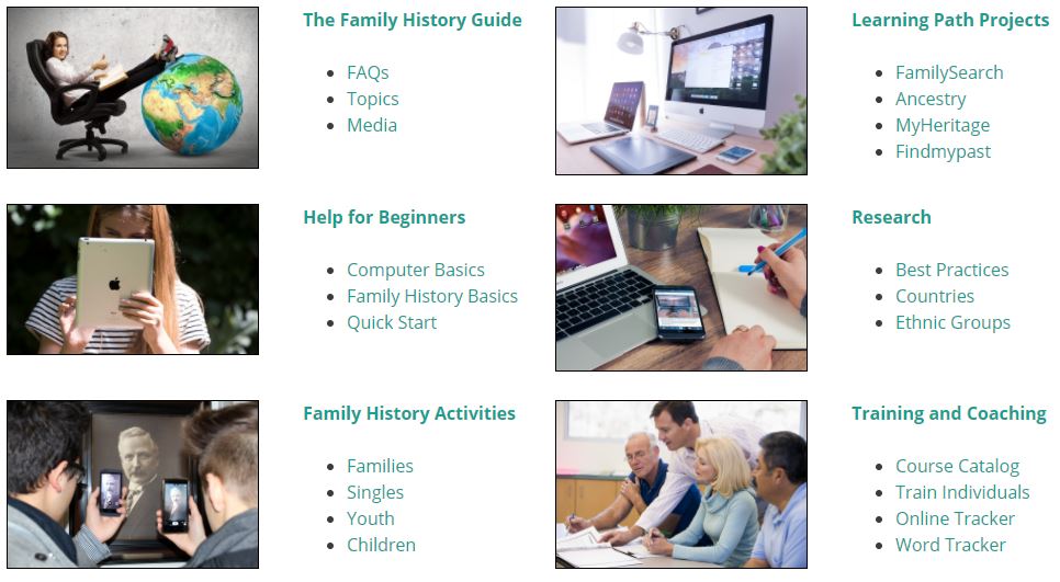
The first thing you’ll notice is that the new design relies on simple picture tiles and bullets – you can find what you want without reading sentences. The tiles and bullets are arranged by category, each linked to the appropriate topic:

Just below the tiles is the “reading box” with text that explains more about website and The Family History Guide Association. Notice that we have added our Mission Statement here as well.

Footers
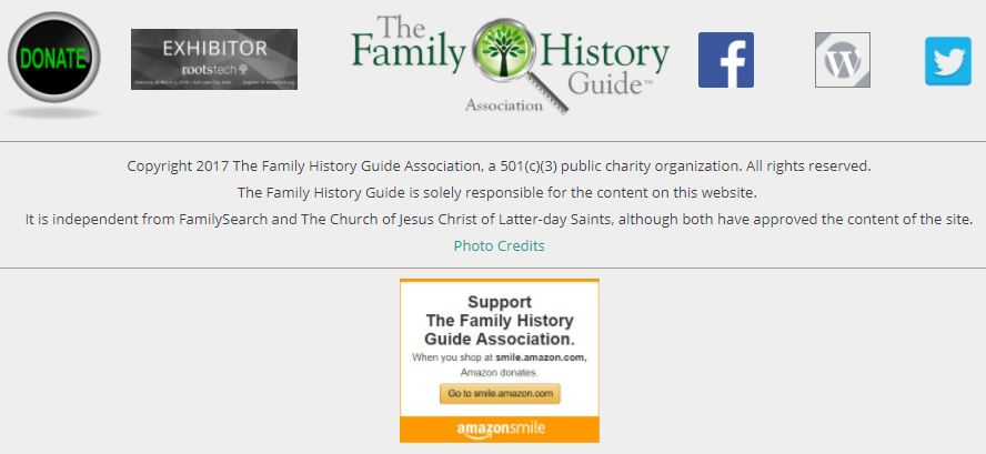
The lower section of the Home page is the footer, and that has been redesigned to include our new RootsTech Exhibitor badge, as well as a new Amazon Smile tile (more about that in an upcoming blog).

Menus
Some of our users have requested that we spell out the Learning Path / Partner abbreviations in the menu (FamilySearch instead of FS, Ancestry instead of AN, etc.) That, plus the need to accommodate more menu items as the site grows, led us to a tiered menu system – there are now two rows of drop-down menu items in the upper right:

Here are a few things that have changed:
- To get back to the Home page, click the logo (upper left) for The Family History Guide.
- The Learning Paths are now spelled out.
- We added Activities, Tracker, Vault, and LDS as a new drop-down menus. These were previously in the “More” menu, which has been removed.
- The Media/Social menu has links to our Blog, Facebook, and Twitter pages, as well as to the brochures, flyers, and videos in The Family History Guide.
- We added the Countries menu, with links to the U.S., Canada, England, and major regions (British Isles, Scandinavia, Asia/Pacific, etc.) plus the Ethnic groups. The previous Countries links at the bottom of the Partner pages have been removed.
- Most abbreviations in previous menus have now been spelled out.
One more important note: the new menus, as well as the updated footer, are now included on each page of The Family History Guide site. No matter where you are, you’ll have the easy-to-use, comprehensive menu system at your command.
We hope you enjoy the new look and feel of the Home page and menus. Try them out at www.thefhguide.com. You can give us feedback at info@thefhguide.com.


Wow! Thank you for all your work. This is an incredible update – The Family History Guide just gets better and better!