New: Mobile-Friendly Updates
A while back we introduced new menus for mobile devices using The Family History Guide. While this was definitely a step forward, some formatting issues have lingered for the phone and tablet views. This week we completed some major updates to get the website looking more consistent on mobile devices, with only minor impact to the desktop view.
Here’s a summary of the changes we made to the website pages to get the mobile views in better shape:
- The long header banners on Project pages, such as Learning Paths and Country pages, have been replaced with the 2-column text and picture entries. This gives a more consistent and simple look to Project pages.
- All tables, except for Site Map, Topics, Vault, and Activities Index, have been replaced with a flexible style that allows the data to collapse into a narrower format for mobile devices. This keeps the three-line (“hamburger”) menu visible and lessens the need for horizontal scrolling on phones in portrait mode. The Site Map and other pages mentioned above have many columns, so keeping them intact reduces clutter.
- The Schedule in the header of the Come, Follow Me page is now collapsible.
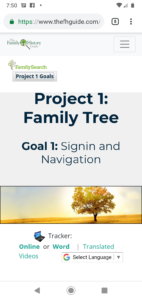
- On each Project page, there is now a Goals button that can hide the Goals. This doesn’t impact the desktop view much, but it’s an important feature for phones, as you can reclaim from 3 to 8 lines of space at the top of the screen by closing the Goals.
- The Activities and Come, Follow Me entries are in a slightly different format to help with mobile formatting.
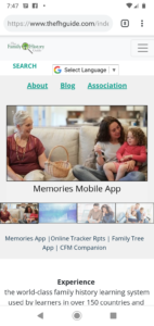
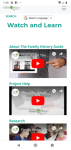
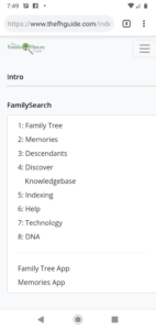
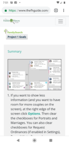
Here are a few screen shots from the phone version of The Family History Guide, in portrait view (Home, Home, Menu, Project 1, and Project 1). You can click each screen to see a larger version.
Try the improved formatting of The Family History Guide website on your phone or tablet. We think you’ll like what you see.
