Site Update: Going Mobile-Friendly
To App or Not to App …
A while ago, we faced a crossroads for mobile devices using The Family History Guide: we could create a special app to be downloaded, or we could make the whole site more mobile-friendly. We chose the latter, and here are a few of the reasons:
- Website content – While the top-level screens of The Family History Guide would be a good match for a separate mobile app, the many content-specific pages (such as countries, the tracker, etc.) would be difficult to package in an app.
- Maintenance – The Family History Guide website is dynamic: we keep up with the ever-changing landscape of family history online. Maintaining a large app and a large website would be a difficult undertaking.
- Mobile-friendly, unified design – With a mobile-friendly site, the same basic design is used for desktop, tablet, and smartphone. The website detects the screen resolution of the device that’s logged on, and it switches the view to full (desktop) or minimized (tablet or phone).
Top Menus
In the desktop view, the main menu items are now arranged in one row across the top, with drop-down items for each:

When you narrow the browser window on a desktop view, the top menu disappears, replaced by the “hamburger menu” (the default for tablets and smartphones).
Hamburger and Fly-out Menus
The “hamburger” menu is an icon with three horizontal lines in the upper-right corner:
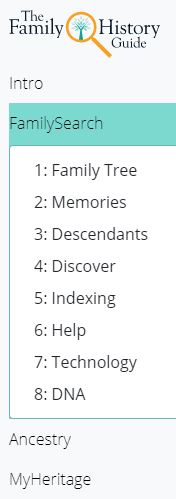
When you click the icon, a fly-out menu appears at the left side of the screen:

You can select any of these items, or you can hover over an item to display a sub-menu:

More
Here are a few additional items we changed on the site to make it more mobile-friendly:
- Down-sized some of the graphics so they load faster on mobile devices
- Shrank the logo for The Family History Guide on mobile so it takes up less space
- Improved formatting in some pages to save vertical space
Enjoy the new mobile-friendly design for The Family History Guide website, whether on desktop, laptop, tablet, or smartphone.


