The Home Page Gets a New Look
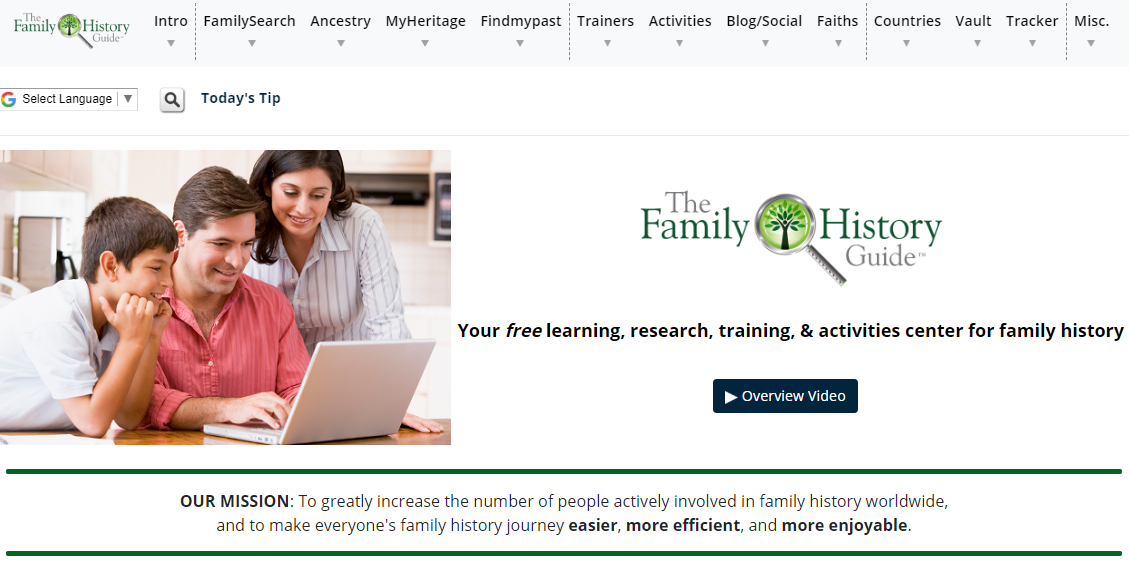
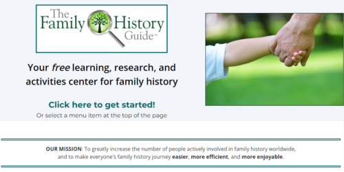
It has been a while coming, and now it’s here: the Home page has a streamlined and simplified look. We think the message of The Family History Guide comes through loud and clear, with the Mission Statement more visible in the middle, and featured in the bottom section. Here’s a look at the top part of the new page:

Menus
The top menu is the same, with a few changes to the Intro menu. New additions include the For Beginners page and the Learning System page. See this blog post for more information:
Just below the top menu is a bar with the Google Translate button and the Search icon (magnifying glass). Also included is the Tip of the Day link, now completing our first month of tips.
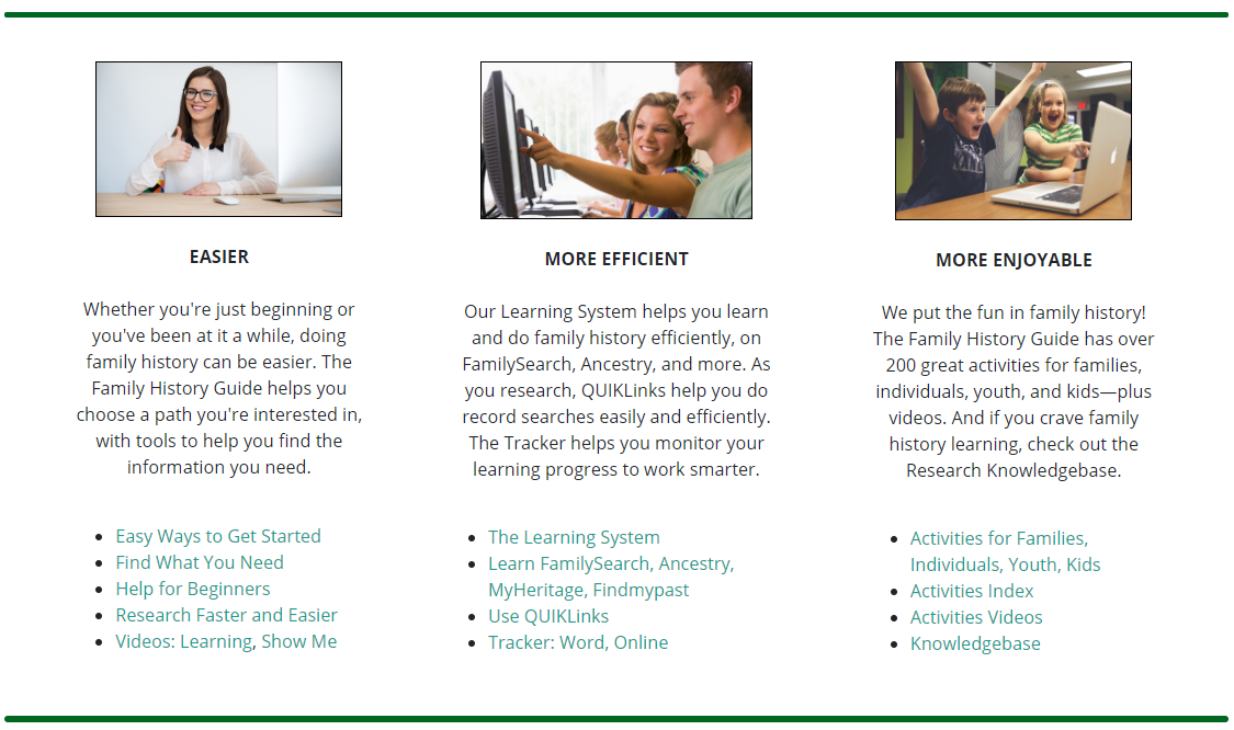
Bottom Section: 3 Parts of the Mission Statement
The bottom section of the Home page leverages the three parts of the Mission Statement: Easier, More Efficient, and More Enjoyable. Each part has a column with descriptions and links you can use to continue your explorations. Here’s a look:

We hope you enjoy the new-look Home page. Take some time to explore the links and discover more about The Family History Guide.


