The Media Page Makeover
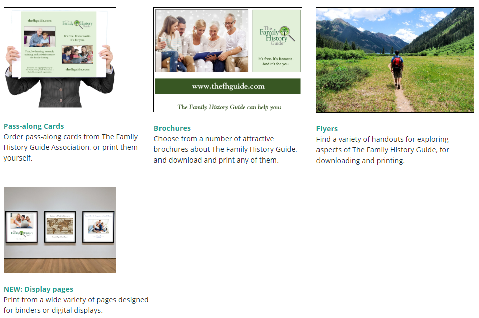
Every so often it’s good to have a makeover, whether it has to do with fashion, home decor, or web pages. We’ve recently done a bit of a makeover with our Media page, to streamline it for appearance and ease of use. Here’s a screen shot of part of the Media Home page:

Below is a summary of additional changes we’ve made:
- The Media page was formerly one long page … now it’s split into five pages: Media Home, Pass-along Cards, Brochures, Flyers, and Display Pages (new).
- As shown above, the Media Home page directs you to each of the main pages.
- There are header links for each of the pages, for quick access.
- On the Brochures page, the “Text-Only” section is now easier to find. (The text-only versions of brochures are great for translation and searchability.)
- We’ve added Display Pages as a category. For more information on display pages and how to use them, see our recent blog post.
We hope you enjoy the new Media pages! There are a lot of helpful resources there, so take some time to review them and see what might be most useful to you and your organization.


